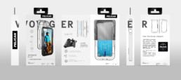
Original designs targeting specific AT&T retailer packaging requirements. When everyone has to follow the same design rules, how do you stand out?
We visited several AT&T stores to document competing designs in order to develop a stand out shelf presence.
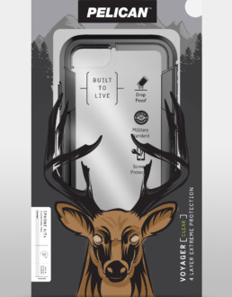
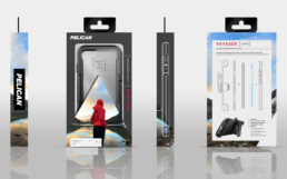
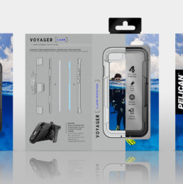
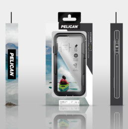
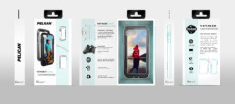
PELICAN Packaging Design
Pelican wanted an outside perspective on its new phone case packaging design. Since we helped write the rules for this brand, so we knew exactly where they could be broken. Our designs leveraged photography to transport the user out of the mall store and into a story of their own. These visual adventures also support the pillars of the Pelican consumer brand – rugged, adventure, and reliability in extreme conditions.
ClientPELICAN ProductsServicesPackaging Design, 3D Rendering, Graphic Design, Illustration

